 |
| Easter Wings by George Herbert |
Definition of CALLIGRAM
: a design in which the letters of a word (as a name) are rearranged so as to form a decorative pattern or figure (as for a seal) — compare monogram
From Wikipedia
A calligram is a poem, phrase, or word in which the typeface, calligraphy or handwriting is arranged in a way that creates a visual image. The image created by the words expresses visually what the word, or words, say. In a poem, it manifests visually the theme presented by the text of the poem. Guillaume Apollinaire was a famous calligram writer and author of a book of poems called Calligrammes. His poem written in the form of the Eiffel Tower is an example of a calligram.
EARLY VISUAL POETRY
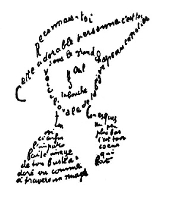
Famous Calligrammes, by Apollinaire
The Calligrammes are an idealisation of free verse poetry and typographical precision in an era when typography is reaching a brilliant end to its career, at the dawn of the new means of reproduction that are the cinema and the phonograph.
Calligrammes by Apollinaire -
http://www.google.com/search?q=apollinaire+calligrammes&hl=en&qscrl=1&nord=1&rlz=1T4ADRA_enUS421US423&biw=1539&bih=822&site=webhp&prmd=imvnsb&tbm=isch&tbo=u&source=univ&sa=X&ei=7SafTtlAg-SIAu_BhYYB&sqi=2&ved=0CCAQsAQ
Apollinaire’s most celebrated Calligrammes
 |


CONTEMPORARY VISUAL POETRY

Image by [Peter Ciccariello’s](http://invisiblenotes.blogspot.com/) “Credible report III”
Visual Poetry
Visual poetry (also called VisPo and concrete poetry) is poetry in which the visual element is as important—or sometimes more important—than the verbal one. It’s meant to be seen. All poetry has a visual component, but visual poetry self-consciously emphasizes and exploits images in the creation of meaning. To many, these poems are not just literary works, but works of art.
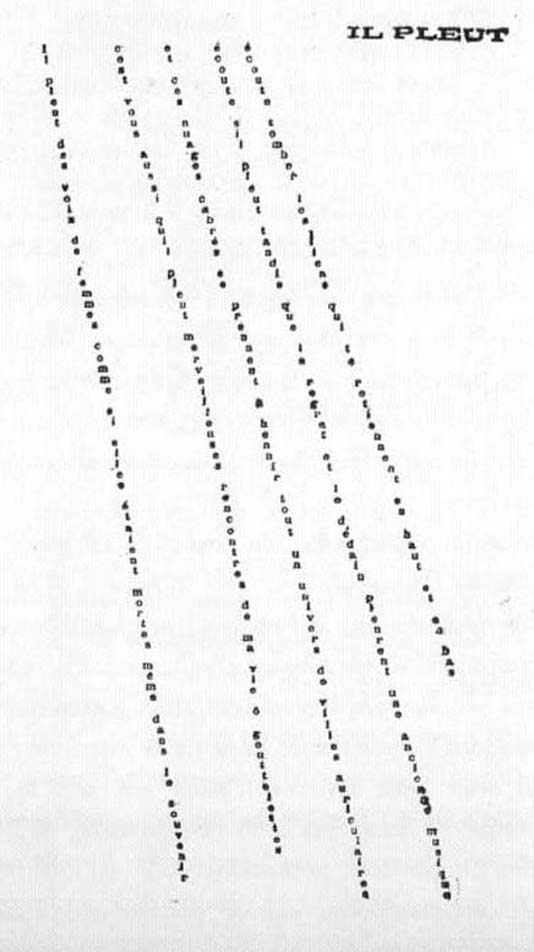
While some claim that visual poetry has existed since humanity’s first use of writing, many see its modern Western beginnings either in 1896 with Mallarmé’s Un Coup de Dés or around 1914 with the work of Guillaume Apollinaire and Italian Futurist F.T. Marinetti.
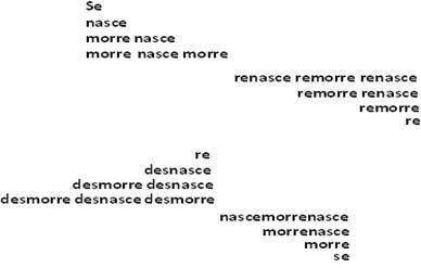
Visual poetry experienced a renaissance in the 1950s and 1960s on the European continent and in Brazil with the movement known as concrete poetry.
Eugen Gomringer, “Wind”
Haroldo de Campos, “Nasce Morre”
Throughout the ‘50s and ‘60s—and afterwards—people also created poetry incorporating more complex pictures. Some labeled it “visual poetry” as a category distinct from concrete poetry. How concrete and visual poetry are classified and related to each other is still open to debate.
Carol Stetser, “Hierogram”
K.S. Ernst and Sheila Murphy, “Vortextique”
Peter Ciccariello, “Proposed monument to the language of rupture”
Today many visual poets have incorporated sound and motion in their poetry: http://vispo.com/
Visual poetry takes a variety of forms. The genre has an elasticity that leads to ever-widening avenues for creation of meaning. The links to the poets here give are just a tiny taste of its rich world.
More Visual Poetry Images -
 |
| L'oiseau_et_le_bouquet |
| Caligrafia_arabe_pajaro_svg |
 |
| Bismillah |
 |
| Figurengedicht_1638 |
 |
| Heinritzh Sales voir son site |
ebon heath: on visual poetry
 Sunday, May 24, 2009 at 9:33AM
Ebon Heath is a Brooklyn-based artist/graphic designer with a love of typography and an interest in giving a dynamic, three-dimensional and physical representation to all the "visual noise" that permeates everyday city life. His work is very much influenced by hip hop. Both lyrically and rhythmically. He sees the work as a way to "cleanse or release content contained inside us."
His work honors *craft* in a heavily digital world. I love the statement he is making. And what a gorgeous statement it is.
Read the article on Yatzer to learn more.
Sunday, May 24, 2009 at 9:33AMEbon Heath is a Brooklyn-based artist/graphic designer with a love of typography and an interest in giving a dynamic, three-dimensional and physical representation to all the "visual noise" that permeates everyday city life. His work is very much influenced by hip hop. Both lyrically and rhythmically. He sees the work as a way to "cleanse or release content contained inside us."
His work honors *craft* in a heavily digital world. I love the statement he is making. And what a gorgeous statement it is.
Read the article on Yatzer to learn more.
 |
| Ebon Heath http://www.yatzer.com/1690_ebon_heath_and_his_visual_poetry |
 |
| Ebon Heath http://www.yatzer.com/1690_ebon_heath_and_his_visual_poetry |
 |
| Ebon Heath http://www.yatzer.com/1690_ebon_heath_and_his_visual_poetry |
The popular song goes that words don’t come easy, and, ironically enough, this is exactly the sense one has when trying to express himself in front of Ebon Heath’s typographic mobiles. Heath is one of the most promising artists of the moment and his take on typography is pure visual poetry. Words never looked more astonishing, they form their own structures in a short of a rebellion, they dance and move and yet they stand still. In Heath’s universe, words go out of their suffocating homes, they become alive and they tell us their amazing stories.
To read more of this article - http://www.yatzer.com/1690_ebon_heath_and_his_visual_poetry
 |
| Ebon Heath http://www.yatzer.com/1690_ebon_heath_and_his_visual_poetry |
ADVERTISEMENTS, BULLETINS, PLAY BILLS AS VISUAL POETRY


Mathematical Masterpieces: Making Art From Equations
Artists use math to create works of art to rival gallery masterpieces.
This is a self-referential bunny — a sculpture of a bunny, the surface of which is tiled by 72 copies of the word "Bunny." This piece is part of a larger series of "autologlyphs," following on from HS's "Sphere Autologlyph" from the 2010 Bridges art exhibition. An autologlyph is a word written or represented in a way which is described by the word itself. This style of autologlyph combines Escher-style tessellation with typographical ideas related to ambigrams.
The bunny was created using a technique published by CSK for transferring a symmetric design to a suitably parameterized mesh surface. We modified the technique to require a quarter as many copies of the fundamental domain as compared with the original version. This allowed us to send a smaller (and more affordable) model to the 3D printer. The design of the word "Bunny" was produced using Adobe Illustrator, then thickened in 2D, triangulated, mapped to the 3D surface, and extruded into a thin shell for manufacture.
 |
|
“Bunny” Bunny by Craig S. Kaplan and Henry Segerman. Plastic, Selective-Laser-Sintered.
|
No comments:
Post a Comment